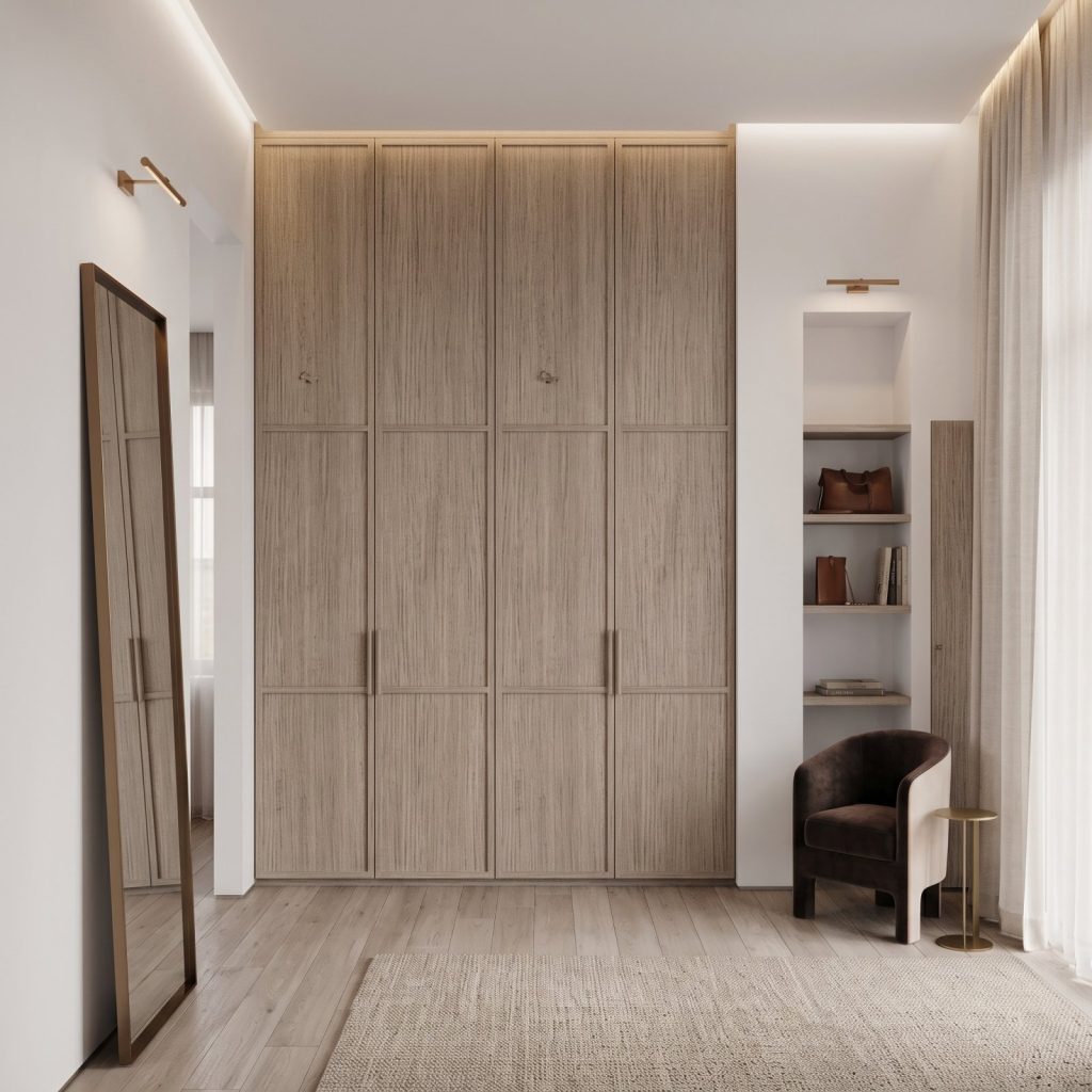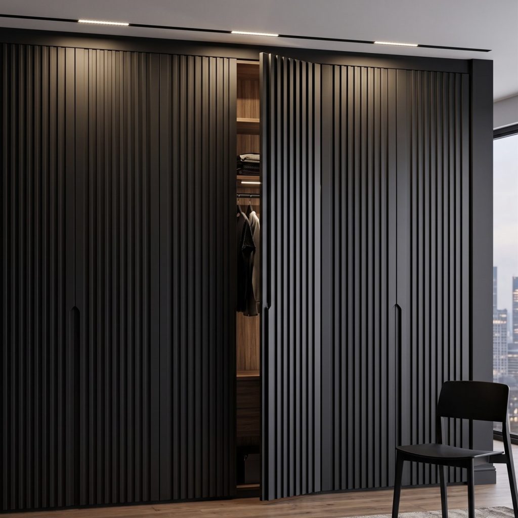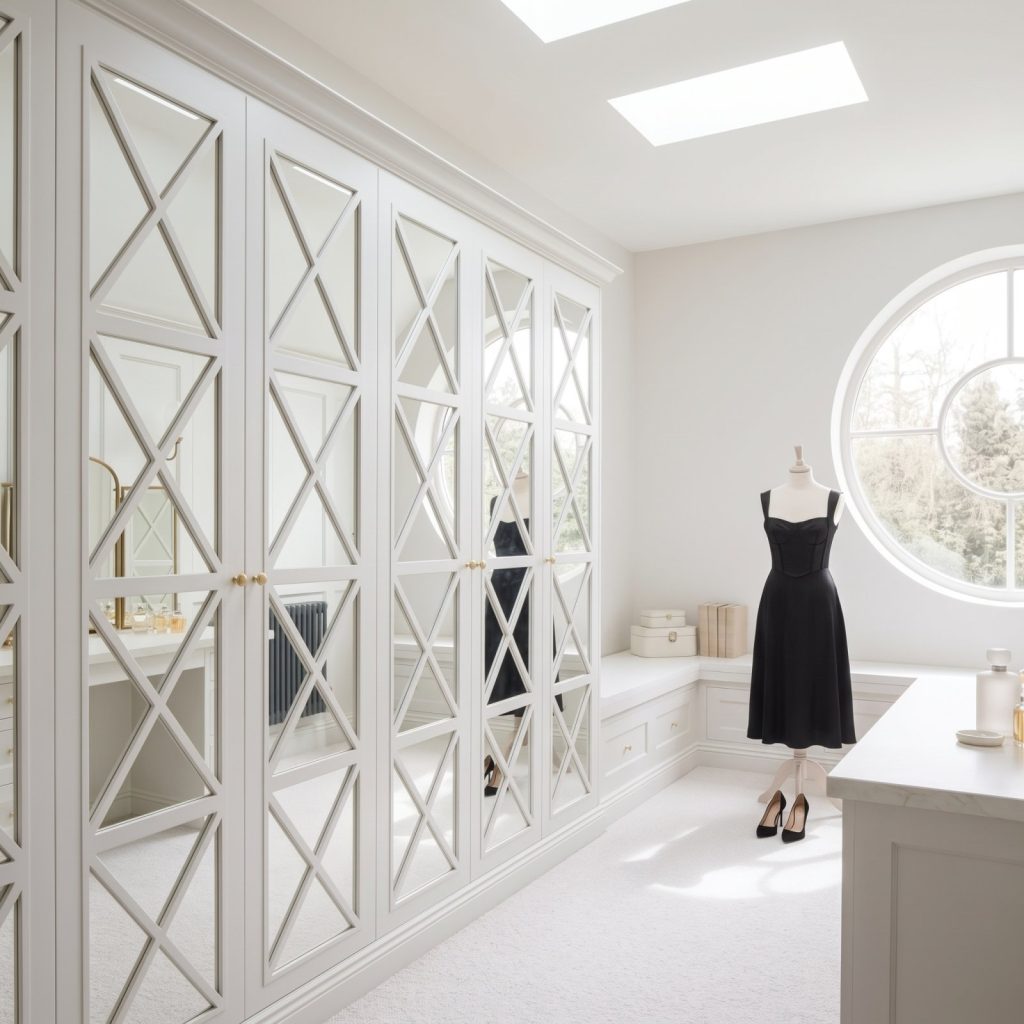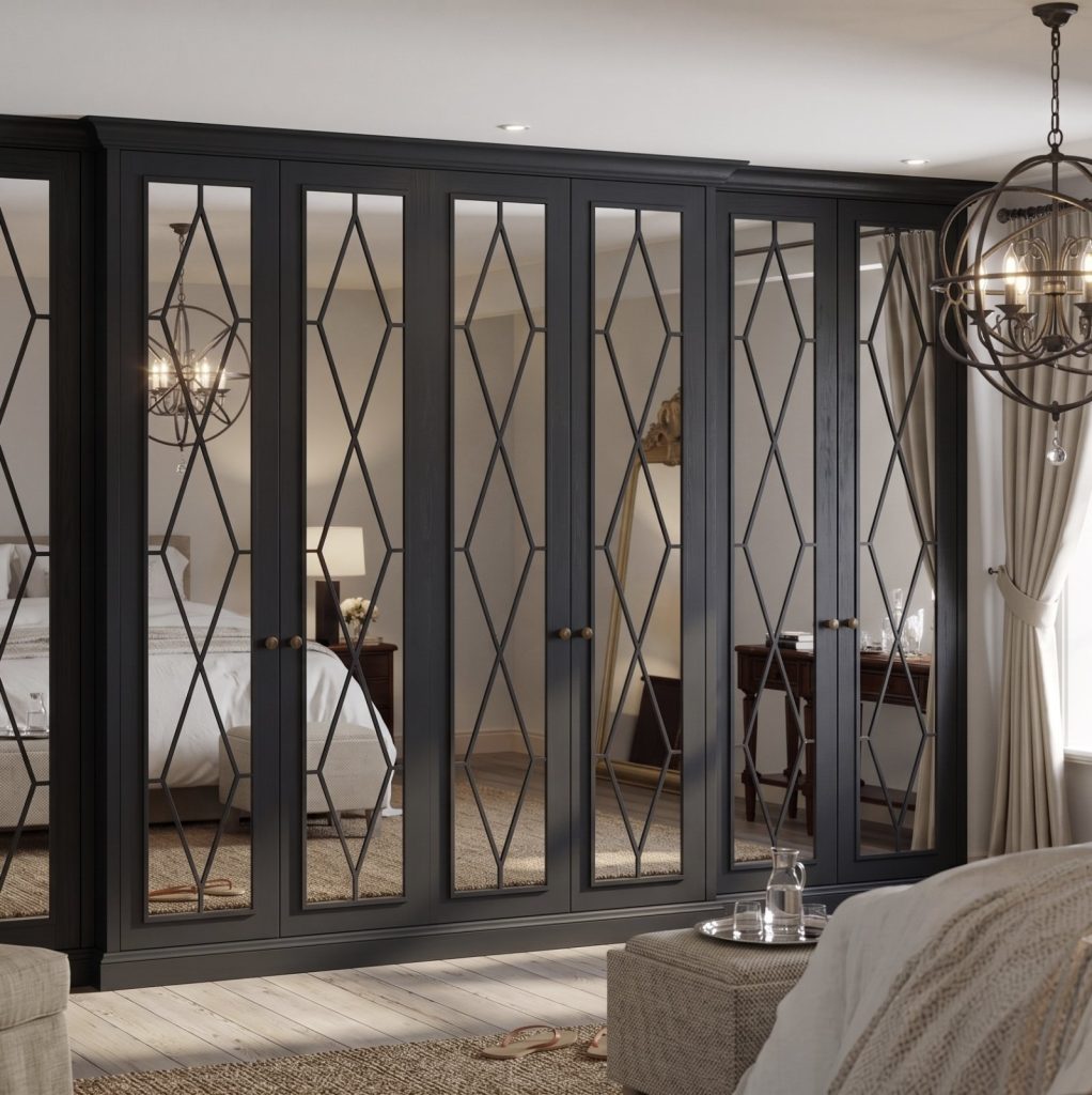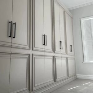
The safest wardrobe colour isn’t always the palest one. Choosing Little Greene colours for wardrobes is about balancing the shade’s undertone with the room, the furniture and the effect you want, whether that means a quiet backdrop or a confident focal point.
It’s easy to focus on a paint chip alone, but a colour can look different beside flooring, bedding and the wardrobe finish. Warm neutrals, muted greens and deeper tones each offer a distinct way to shape a room.
This guide explores how to choose a shade, with real-home examples and ideas for cupboards and fitted furniture. See how colours such as Silent White, French Grey and Hopper can inform a scheme, and how contrast, related tones and surrounding finishes help create a considered result.
Key Takeaways
- Use a shade’s undertone and the room’s existing finishes to guide your wardrobe colour choice.
- See how colours used in real homes can help you picture a scheme in your own space.
- Explore ways to use colour on cupboards and fitted furniture, from subtle neutrals to more expressive combinations.
- Discover how bespoke fitted wardrobes and different door designs can bring a considered colour scheme into the room.
1. Choosing and using Little Greene paints
Choosing Little Greene colours for wardrobes starts with each shade’s undertone and how it relates to the room. Little Greene describes Silent White as a neutral white based on umber and ochre, while Haye White has an ochre warmth. For a softer, less yellow look, Barge Stone has a gentle green undertone. These distinctions can help narrow your palette before you choose a finish.
In the UK, Little Greene paint costs depend on the paint selected and tin size. The quantity needed for a wardrobe depends on its dimensions, the surfaces to be painted and the number of coats. Measure the doors and other surfaces, then use the selected paint’s coverage information to estimate how much you need.
Little Greene colours can serve as references for colour-matching wardrobe doors, though results may vary between paint systems and finishes. Provide the exact shade name, then assess a sample beside the room’s flooring and furnishings. A sample also helps you judge how the colour changes in daylight.
When considering Little Greene colours for wardrobes, look at how each shade relates to the walls. A gentle neutral grey can let accessories take the spotlight, while Rolling Fog brings pink, red and brown tones. Little Greene recommends pairing neutrals with deeper versions of the same hue or contrasting them with bolder shades. French Grey is described as a warm tone that works with stronger colours in living spaces and bedrooms.
For a more enveloping scheme, double-drenching uses related shades with varying undertones. Choose the wardrobe shade after deciding whether it should blend into the room or provide contrast. Little Greene has been mixing paints since 1773, and its varied neutrals offer distinct starting points for either approach.
2. Examples of Little Greene paint colours in real homes
Real rooms show how a wardrobe colour can relate to more than the walls. In one bedroom, Windmill Lane sits alongside natural wood floors and furniture, offering a useful reference for wardrobes beside timber. Juniper Ash appears on bedroom walls with panelling, velvet finishes and chrome details, showing how deep blue can work in a layered scheme.
Other examples demonstrate different levels of contrast. A lighter paint colour can contribute to a bright bedroom scheme. Masquerade covers bedroom walls and woodwork, while Blush on the ceiling adds a separate colour note. In another bedroom, the wardrobe, chest of drawers, stool and chair are painted French Grey, showing how one shade can unite several pieces of furniture.
Little Greene and Farrow & Ball have distinct colour ranges, so the brand name alone won’t tell you which shade suits a room better. Compare specific colours by undertone and appearance beside your flooring, walls and textiles. A named colour can look different depending on its surroundings and the room’s light.
For wardrobe inspiration, note which element leads each scheme. The natural wood in the Windmill Lane bedroom brings warmth; Juniper Ash gains depth from velvet and panelling. At Euston Hall, a historic setting dating from the 1600s offers another context for considering colour with traditional details. These examples can guide the balance between a painted wardrobe and the room around it. Explore wardrobe design examples to see how furniture styles shape a finished interior.
3. Little Greene colours used on cupboards and fitted furniture
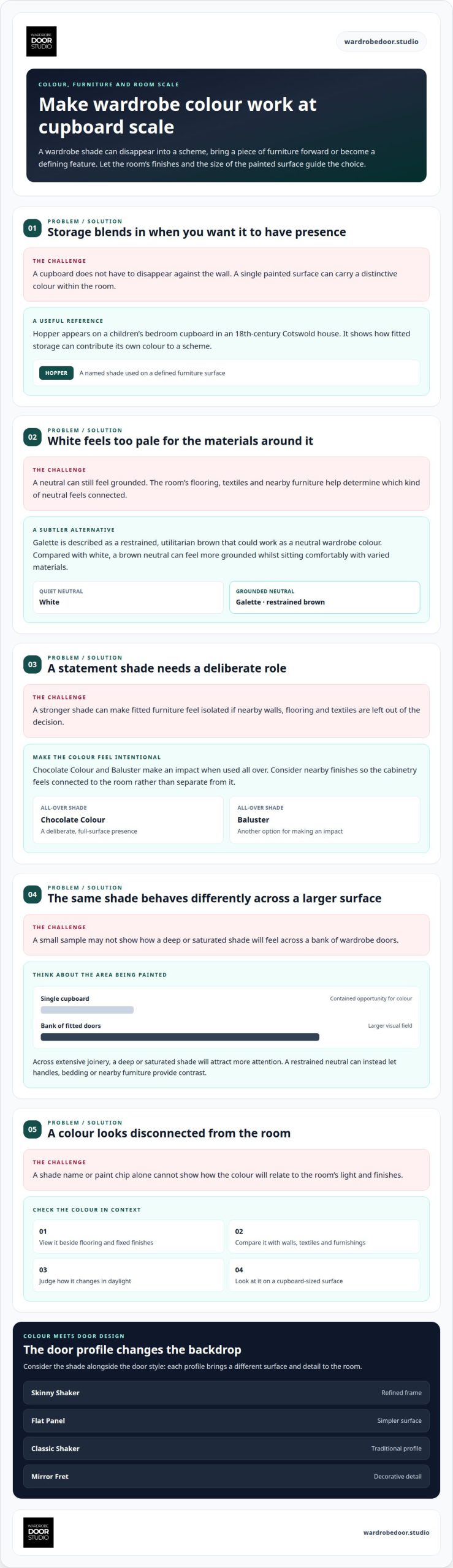
Painted cupboards show how colour behaves across a defined furniture surface. In an 18th-century Cotswold house, a children’s bedroom cupboard is painted Hopper. The example demonstrates how a cupboard can carry a distinctive colour within a room, rather than simply disappearing against the wall. For wardrobes, consider how much visual emphasis the doors should bring to the overall scheme.
The best neutral Little Greene wardrobe colours depend on the room’s finishes and the effect you want. Galette is a restrained, utilitarian brown that the BBC suggests could work as a neutral wardrobe colour. A brown neutral can feel more grounded than white, while still sitting comfortably alongside varied materials.
For a stronger statement, Little Greene says Chocolate Colour and Baluster make an impact when used all over. Applied across cupboard fronts, a single all-over shade gives fitted furniture a deliberate presence. Consider nearby wall colours, flooring and textiles, too, so the cabinetry feels connected to the room rather than isolated.
Scale matters, too. A single cupboard offers a contained opportunity for colour, while a bank of fitted wardrobe doors creates a larger visual field. A deep or saturated shade will attract more attention across extensive joinery. A restrained neutral can instead let handles, bedding or nearby furniture provide contrast.
Before settling on a scheme, view the proposed shade beside the room’s fixed finishes and existing furniture. Compare it on a cupboard-sized surface, not just a small sample. Hopper on a bedroom cupboard offers a clear example of treating fitted storage as part of the room’s design, while Galette provides a subtler brown alternative.
Wardrobe Door Studio: Bespoke Fitted Wardrobes
Wardrobe Door Studio can help bring a considered colour scheme together with fitted storage. Bespoke Fitted Wardrobes allow the design to be considered as part of the room, rather than as a standalone colour choice.
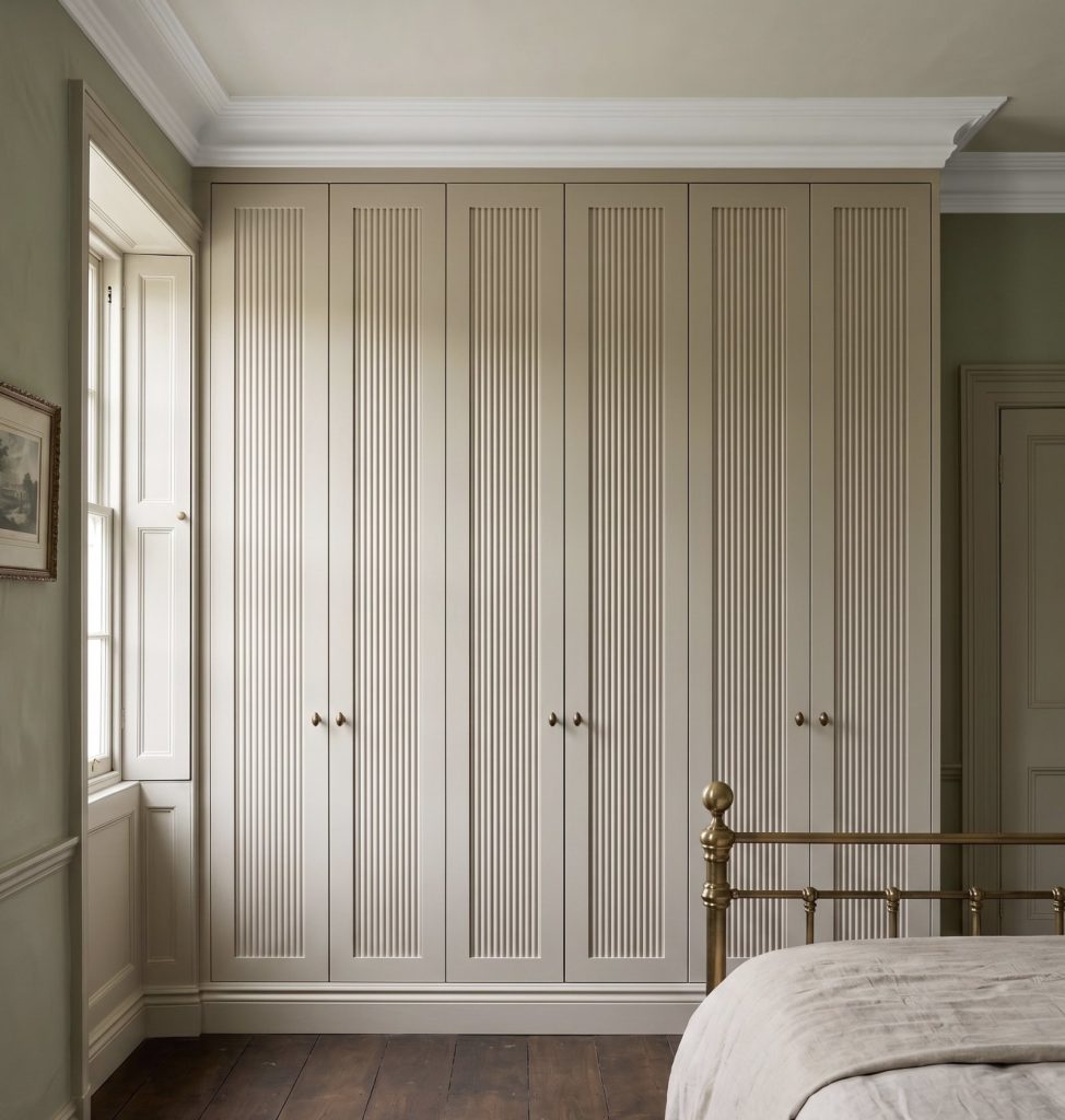
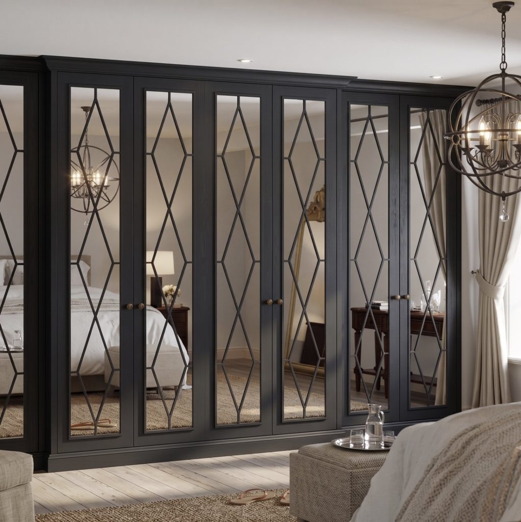
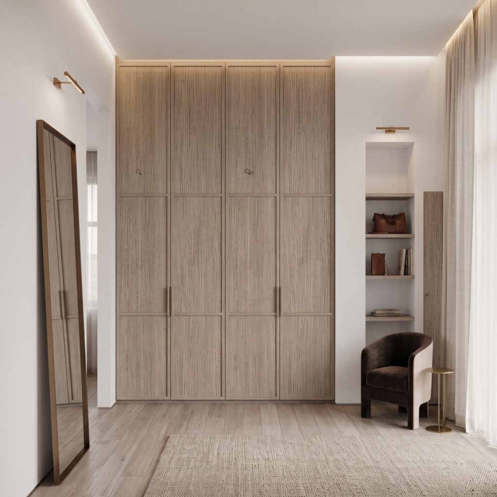
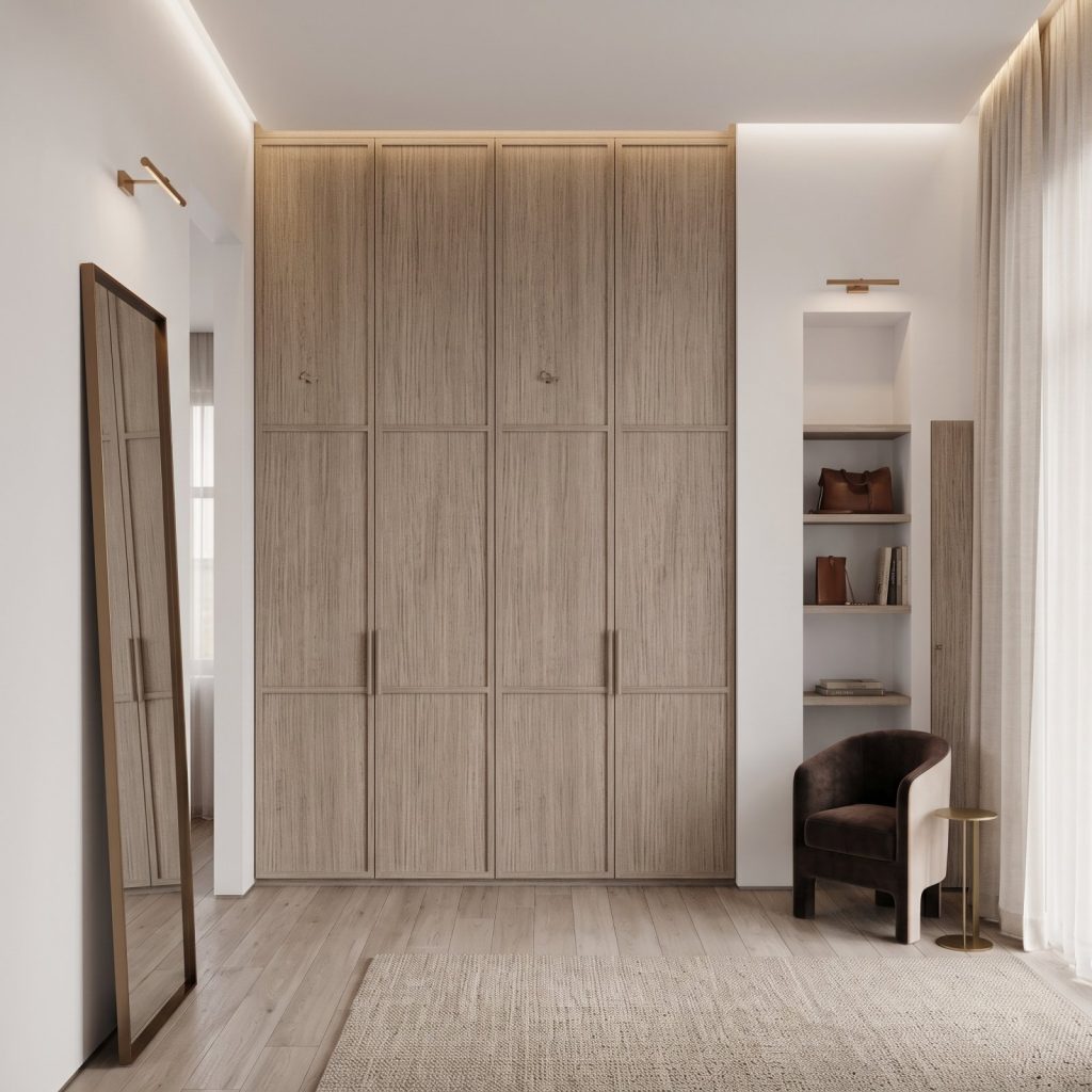
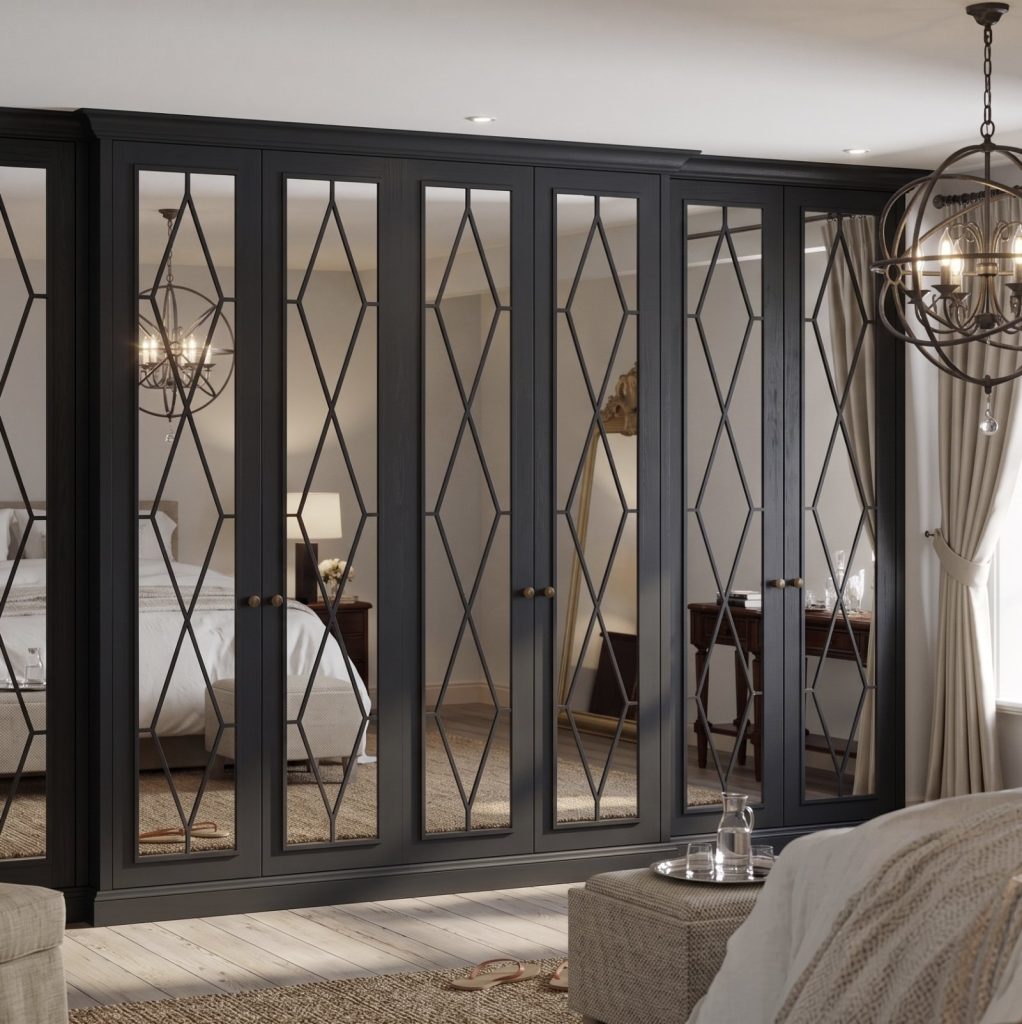
Door style also influences how a shade looks in the room. Skinny Shaker Wardrobe Doors introduce a refined frame, while Flat Panel doors offer a simpler surface. Classic Shaker Wardrobe Doors bring a traditional profile, and Mirror Fret Wardrobe Doors add decorative detail. Each creates a different backdrop for colour and surrounding finishes.
For a cohesive result, consider the chosen shade alongside the wardrobe’s door design and the room’s existing details. Contact Wardrobe Door Studio to discuss Bespoke Fitted Wardrobes for your space.
Shape your wardrobe around the colour
A considered palette can guide more than the paint choice. Let it inform the wardrobe’s profile, detailing and overall presence, so colour and craftsmanship feel resolved together. The same shade can make a different impression on a Skinny Shaker, Classic Shaker or Mirror Fret door, as each design brings its own lines and visual detail.
As you develop your scheme, consider how the wardrobe should relate to the room’s architecture and furnishings. A tailored design brings those decisions together, whether you’re planning a complete fitted interior or refining the look of your storage.
Contact Wardrobe Door Studio to discuss the direction you have in mind. Your chosen colour can be the starting point for a wardrobe that feels thoughtfully made for its setting.
Frequently Asked Questions
Which Little Greene paint colours are popular for wardrobes?
A practical shortlist of Little Greene colours for wardrobes includes Silent White, Rolling Fog, China Clay and Galette. Choose based on the effect you want: a pale neutral can recede, while a pink-based neutral or restrained brown adds character. Compare shortlisted shades with the wardrobe handles and nearby furnishings before deciding.
What Little Greene colours work best for bedroom wardrobes?
For a bedroom wardrobe, choose a shade that suits the atmosphere you want for rest. French Grey can work in a scheme with stronger colours, while Masquerade offers another option for coordinating painted furniture. If the room already has patterned bedding or prominent artwork, a quieter wardrobe colour can help keep the overall scheme composed.
Which Little Greene colours suit fitted wardrobes in small rooms?
To choose Little Greene colours for wardrobes in a compact bedroom, consider whether the doors should blend with the walls or provide clear contrast. A light shade can create continuity with pale walls, while a muted neutral adds subtle definition. Also consider how the door layout affects how much colour is visible across the room.
Which Little Greene dark colours work well on wardrobes?
Juniper Ash, Chocolate Colour and Ganache are options for a darker wardrobe scheme. Use a deep shade on the doors as a deliberate focal point, especially where lighter walls or bedding provide contrast. Before committing, consider how the wardrobe looks in natural and evening light, as both can change its apparent depth.
How do I prepare and paint a wardrobe with Little Greene paint?
First, remove handles and other detachable hardware, then clean the surfaces and let them dry. Lightly abrade the existing finish where appropriate, remove dust and repair any damaged areas. Check the paint tin’s guidance for the wardrobe material and existing coating, including primer requirements. Apply the specified coats and allow each to dry as directed before refitting the hardware.