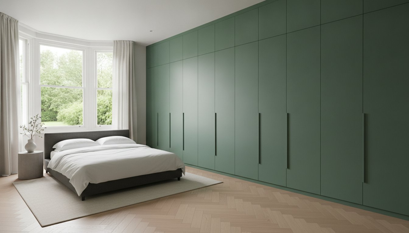
True luxury in modern interior design is often found in what you cannot see, specifically the invisible transition between your architecture and your cabinetry. Achieving a flawless result when colour matching wardrobe doors to walls is the hallmark of a sophisticated home, yet many homeowners find themselves trapped between clashing undertones and ‘near-miss’ finishes that break the visual flow. You want your Skinny Shaker or Flat Panel Wardrobe Doors to feel like a natural extension of your space, not an afterthought that disrupts the serenity of your bedroom.
It’s understandable to feel overwhelmed by the technicalities of matching MDF surfaces to emulsion wall paint, especially when navigating the myriad of paint brands and codes available in 2026. This guide promises to demystify the process, showing you how to synchronise your palette for a high-end, cohesive result. We’ll examine the meticulous hand-sprayed manufacturing process that ensures durability and precision, whilst explaining how to specify exact matches that satisfy even the most discerning eye. From understanding the latest formaldehyde emission regulations to mastering the art of colour drenching, you’ll gain the expertise needed to transform your storage into a bespoke architectural feature.
Key Takeaways
- Learn how the 2026 trend of colour drenching uses a single shade across walls and cabinetry to create the illusion of expanded space whilst maintaining architectural unity.
- Master the technical process of colour matching wardrobe doors to walls by moving beyond simple emulsion paint to professional hand-sprayed finishes that ensure durability.
- Understand the critical role of Light Reflectance Value (LRV) and metamerism to ensure your chosen shade remains consistent under different lighting conditions.
- Discover how different door profiles, such as Skinny Shaker or Flat Panel designs, interact with light and shadow to influence the final appearance of your colour palette.
- Identify the essential steps in a bespoke design consultation to ensure your furniture is treated as a seamless architectural element rather than a separate unit.
The Rise of Colour Drenching: Why Match Your Wardrobes to Your Walls?
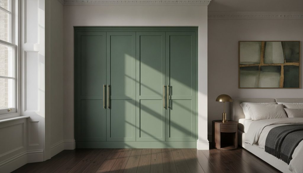
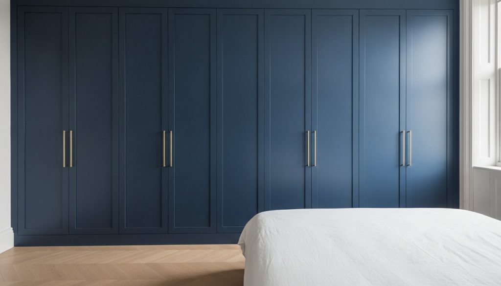
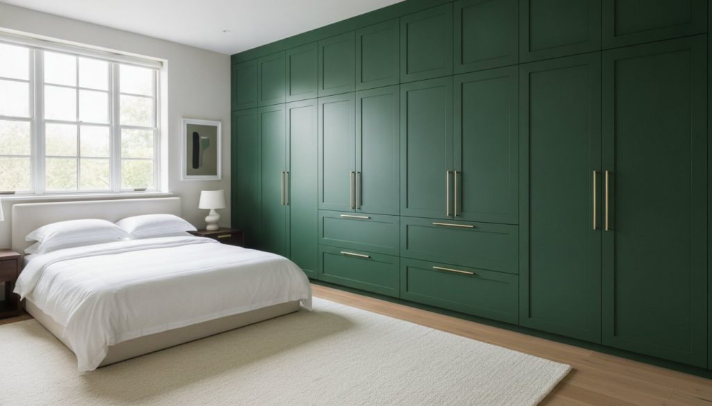
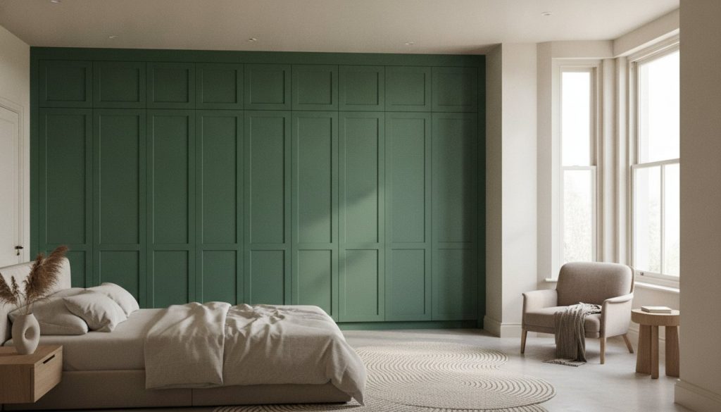
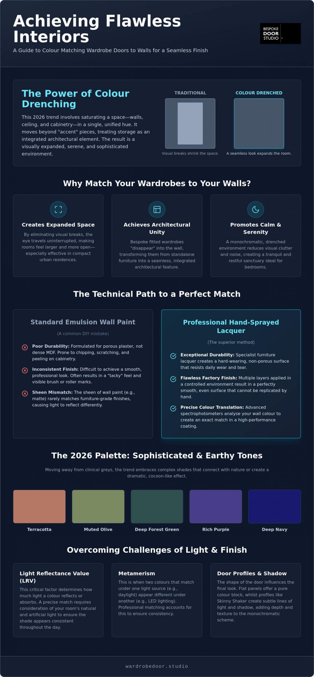
Colour drenching has redefined the modern bedroom. It involves saturating a space in a single hue, extending from the walls and ceilings directly onto the cabinetry. This technique moves away from the dated concept of “accent” furniture. Instead, it treats storage as a structural element. By colour matching wardrobe doors to walls, you eliminate the visual breaks that usually shrink a room. The eye travels uninterrupted across the surface, creating a sense of calm that is essential for a sleep environment. It’s a bold move. It works.
Creating Architectural Seamlessness
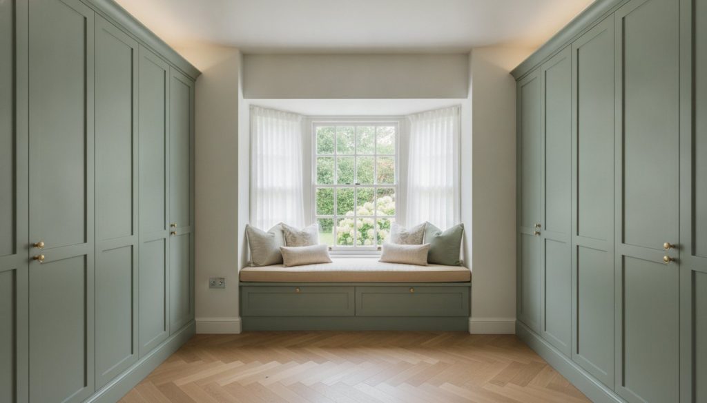
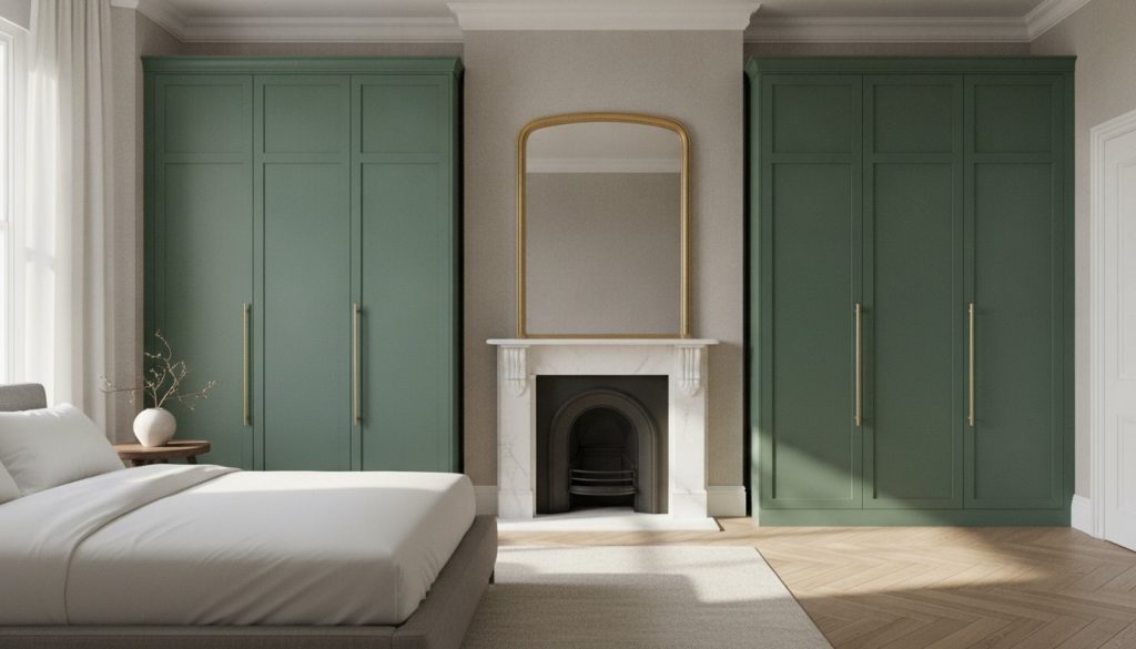
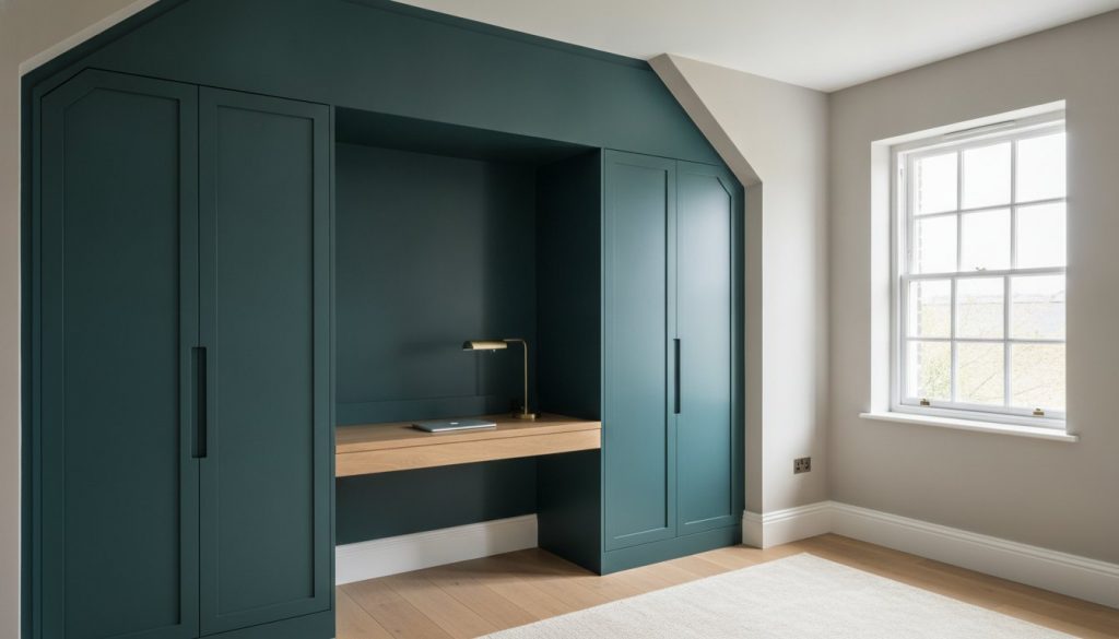
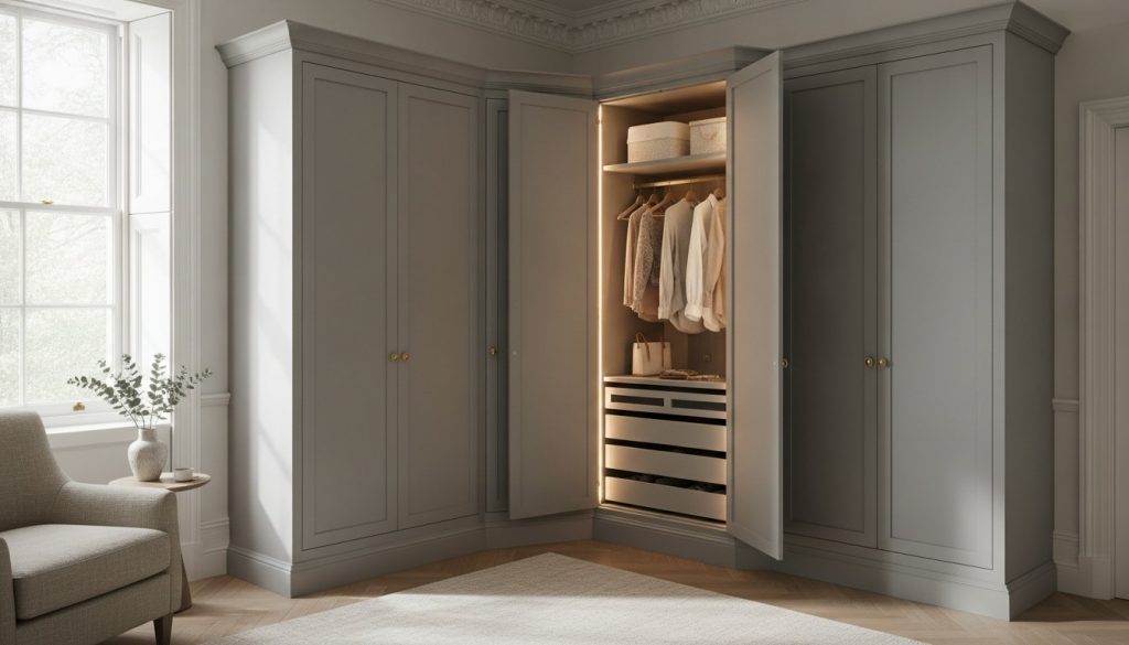
Traditional freestanding furniture often feels like an intrusion. In contrast, bespoke fitted wardrobes that match the wall colour offer an integrated architectural look. This approach is particularly effective in modern London residences where space is at a premium. Large wardrobes can dominate a room, but when they share the wall’s exact shade, they effectively “disappear” into the footprint. Floor-to-ceiling designs further enhance this effect by removing the shadows at the top and bottom that would otherwise betray the wardrobe’s presence. This level of integration is why the technique is favoured amongst high-end interior designers.
The 2026 Palette: Beyond Basic Neutrals
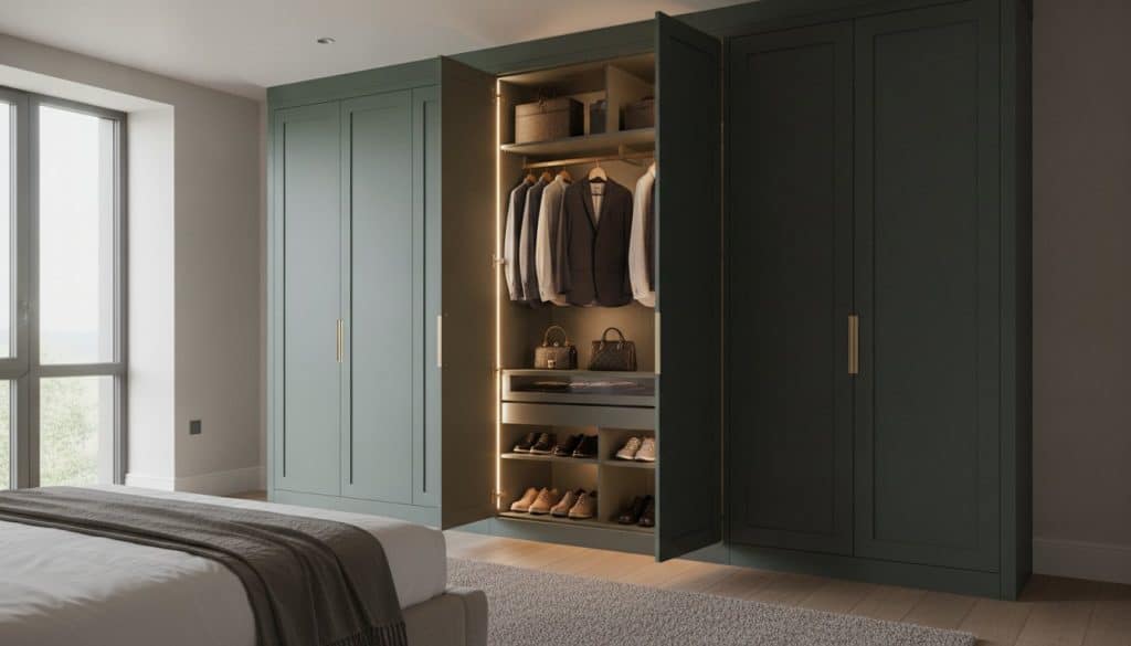
Design trends for 2026 show a decisive shift away from the clinical greys of the last decade. We are seeing a move towards sophisticated, earthy tones. Terracotta, muted olives, and deep forest greens are becoming the preferred choices for those seeking a connection to nature. For a more dramatic “cocoon” effect, rich purples and deep navies are being used across all surfaces. This requires a deep understanding color theory to ensure the chosen shade doesn’t become oppressive. When the palette is unified, even dark colours can feel expansive rather than confining. It’s about choosing a favourite shade that creates a lasting sanctuary.
Profiles like skinny shaker wardrobe doors benefit immensely from this treatment. The fine lines of the shaker frame provide just enough texture to catch the light, preventing the monochromatic look from feeling flat. It creates a subtle interplay of light and shadow whilst maintaining the overall colour drenching aesthetic. This balance between texture and uniformity is what distinguishes a professional installation from a standard DIY effort. You aren’t just painting a cupboard; you’re designing a room.
The Technical Path to a Perfect Colour Match
Achieving a seamless aesthetic requires more than just selecting a shared name from a paint chart. When colour matching wardrobe doors to walls, the chemistry of the coating is as vital as the pigment itself. Wall emulsion is formulated for porous plaster; it’s designed to be breathable and flexible. In contrast, bespoke cabinetry requires a durable, hard-wearing furniture lacquer. Using standard wall paint on wardrobe doors is a common mistake that leads to peeling, scratching, and a finish that feels “tacky” to the touch. Professional results demand a technical translation of your chosen wall shade into a high-performance coating.
The superior method for this transition is hand-sprayed finishing. This process involves applying multiple layers of specialist lacquer in a controlled environment, ensuring a smooth, factory-level finish that emulsion simply cannot replicate. Before any manufacturing begins, the importance of physical colour swatches cannot be overstated. Digital screens often distort hues, so seeing a physical sample in your room’s specific light is the only way to guarantee a true match. Understanding The Technical Path to a Perfect Colour Match ensures that your investment retains its beauty for years rather than months.
Matching Designer Brands: Farrow & Ball to Little Greene
Professional workshops don’t just “guess” a designer shade. They use advanced spectrophotometers to analyse the specific light-reflecting properties of brands like Farrow & Ball or Little Greene. This data allows technicians to recreate the exact undertone in a durable furniture lacquer. Whether you are matching a Flat Panel design or a more intricate profile, this precision ensures that the wardrobe doors and the plastered walls react to light in the same way. It maintains the integrity of the designer’s palette whilst providing the resilience needed for daily use.
RAL and NCS Systems for Precision
For those seeking industrial-grade accuracy, the RAL and NCS (Natural Colour System) frameworks are indispensable. Interior designers often use the NCS system to coordinate entire room schemes, as it describes colours exactly as we see them. High-density fibreboard serves as the ideal substrate for these precision finishes, providing a stable, ultra-smooth surface that allows the colour to sit perfectly. This level of technical specification is what separates a standard fitted unit from a truly bespoke architectural element. You might find that reviewing our bespoke fitted wardrobes collection helps you visualise how these precision colours transform a space.
Style and Substance: How Door Designs Interact with Colour
The success of a unified interior depends on how light interacts with the geometry of your furniture. When colour matching wardrobe doors to walls, the physical profile of the door determines the intensity of shadows cast across the cabinetry. Flat Panel Wardrobe Doors offer the most seamless transition for minimalist interiors. Because the surface is entirely flush, there are no recessed panels or decorative edges to create tonal variation. This allows the wardrobe to blend almost invisibly into the room’s architecture, a technique recognised as a top color trend for the coming years. The absence of shadow ensures that the pigment on the door looks identical to the pigment on the plaster, regardless of the time of day.
In contrast, more traditional profiles like Classic Shaker Wardrobe Doors introduce depth through their recessed panels. These recesses catch shadows, which can make the colour in the centre of the door appear slightly darker than the surrounding wall. This isn’t necessarily a flaw; many designers use this natural shading to add a layer of texture to a monochromatic room. It prevents the space from feeling clinical by introducing subtle, organic variations in the hue. Understanding this behaviour is essential for anyone aiming to master the art of colour matching wardrobe doors to walls whilst maintaining a sense of warmth and character.
Skinny Shaker: Modernising the Match
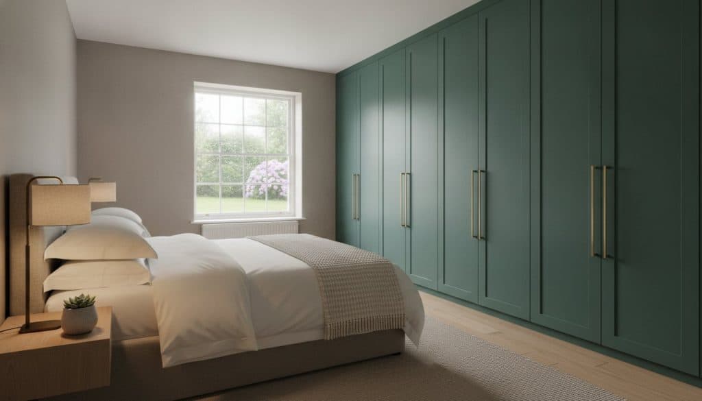
The Skinny Shaker Wardrobe Doors profile represents a refined evolution of a classic design. Its slim frame creates delicate shadows that define the cabinetry without making the colour feel heavy or overwhelming. This style is particularly effective when you want to avoid a flat, “painted wall” look whilst still maintaining a unified palette. To add further sophistication, we often recommend a slightly different sheen level for the frame compared to the wall. This subtle contrast provides depth and tactile interest, making it a leading choice for 2026 bedroom schemes where tonal matching is the priority. It offers the perfect middle ground between the starkness of a flat panel and the traditional weight of a standard shaker.
Mirror Fretwork and Reflective Surfaces
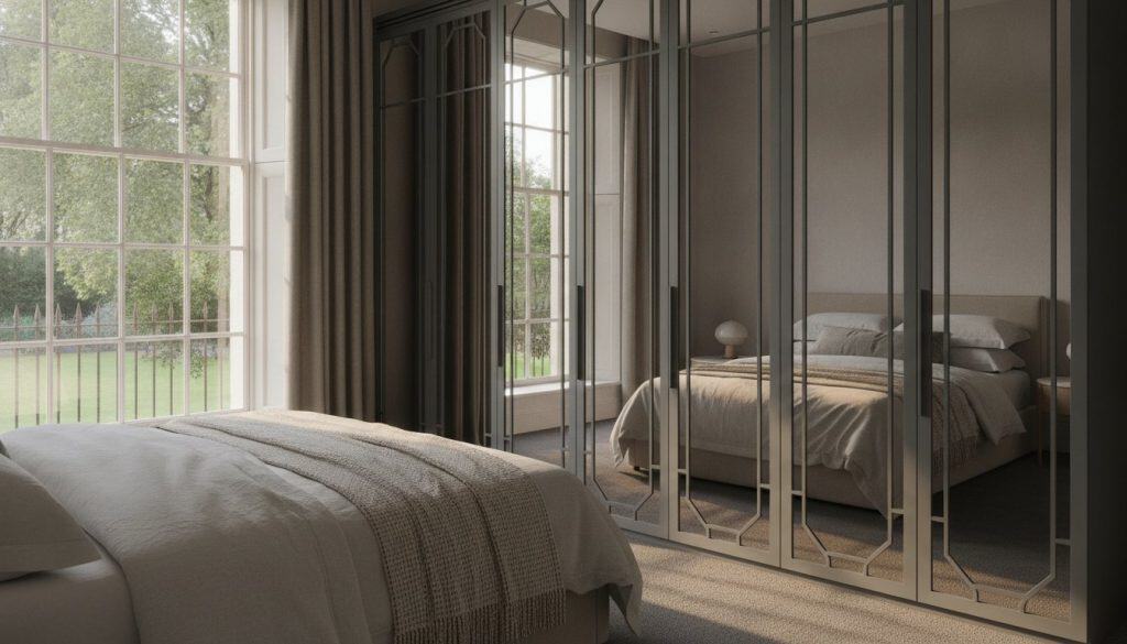
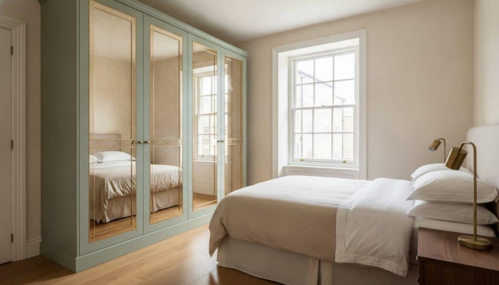
Integrating Mirror Fret Wardrobe Doors into a colour-matched scheme requires a careful balance of solid and reflective elements. The mirror glass breaks up the expanse of a single colour, preventing large wardrobes from feeling monolithic in smaller rooms. By matching the fretwork frames exactly to the wall colour, you anchor the reflective panels within the room’s design. This ensures the mirrors feel like an intentional architectural feature rather than a separate piece of furniture. It’s a sophisticated way to introduce light and the illusion of depth whilst keeping the overall aesthetic strictly cohesive. Choosing a fretwork pattern that mirrors existing window frames or ceiling mouldings further strengthens this sense of bespoke integration amongst contemporary homes.
Overcoming the Challenges of Light and Sheen
Even with a perfect pigment match, light can be a fickle collaborator. You might find that a shade looks flawless in a bright design studio, only to appear entirely different once installed in your home. This phenomenon is known as metamerism; it occurs because different light sources, such as natural daylight and artificial LEDs, have varying spectral power distributions. When colour matching wardrobe doors to walls, understanding how your specific environment influences colour is just as important as the paint code itself. A colour that feels warm in a showroom might lean towards a cool, clinical blue under the grey skies of a British winter.
Light Reflectance Value (LRV) is a critical metric in this process. It measures the percentage of light a colour reflects on a scale from 0 to 100. If your wardrobe doors have a significantly different LRV than your walls, they will either absorb too much light or reflect it too aggressively. This creates a visual jarring effect that breaks the seamless drenching aesthetic. To ensure your cabinetry truly integrates, we analyse how the chosen hue behaves at different times of the day. Shadows in the corners of a room naturally make matched wardrobes appear slightly deeper in tone, so testing samples in situ is a non-negotiable step for a luxury finish.
The Science of Sheen Levels
Sheen levels play a vital role in how the eye perceives colour saturation. A 10% matt finish often provides the most successful architectural match to standard emulsion paint, as it absorbs light in a similar fashion. However, for high-traffic areas, a 20-30% satin finish offers enhanced durability and is easier to wipe clean. It’s important to remember that glossier finishes tend to make colours appear darker and more saturated because they reflect light in a more concentrated way. Choosing the right sheen is a balance between the desired aesthetic and the practicalities of daily use.
Lighting Considerations in the Bedroom
The orientation of your room dictates the quality of natural light you receive. North-facing rooms often have a cool, bluish light that can make warm tones look muddy. Conversely, South-facing rooms enjoy a golden glow that can intensify yellow or red undertones. Your choice of artificial lighting also matters; cool-white LED bulbs will flatten a colour, whilst warm-white bulbs will enhance its richness. Before committing to a final palette, we recommend checking your colour samples under both natural and artificial light. Ready to achieve a flawless finish? Discover how our bespoke fitted wardrobes can be tailored to your room’s unique lighting conditions.
The Bespoke Journey: From Concept to Colour-Matched Reality
Every successful interior transformation begins with a clear strategic vision. When colour matching wardrobe doors to walls, the transition from a digital mood board to a physical reality requires a meticulous, structured approach. A bespoke fitted wardrobes project is not merely a furniture purchase; it is a collaborative design journey that treats your storage as a fundamental part of the room’s architecture. Achieving that coveted “invisible” look relies on a combination of technical precision, local craftsmanship, and professional installation that eliminates the gaps or misalignments common in off-the-shelf solutions.
The foundation of this journey is the initial design consultation. This is where the colour strategy is defined, ensuring that the chosen palette harmonises with the room’s orientation and lighting conditions discussed in previous chapters. By opting for UK-manufactured, hand-sprayed doors, you maintain ultimate control over the final aesthetic. This local production allows for a level of oversight and customisation that mass-produced imports simply cannot match, providing a reliable path to a high-end finish that stands the test of time.
Consultation and Colour Specification
Working with a specialist allows you to navigate the complexities of designer paint brands with confidence. During the specification phase, we help you select the exact brand and code that will define your space. We don’t rely on digital approximations; instead, we recommend requesting a hand-sprayed sample on the actual door material, typically high-density MDF, before full production begins. This step is vital because the substrate’s texture affects how the pigment settles. Once the colour and sheen are finalised, the focus shifts to hardware. Selecting handles that either blend into the unified colour scheme or provide a deliberate, high-contrast metallic accent is the final touch in creating a cohesive, luxury environment.
Precision Manufacturing and Installation
The manufacturing process takes place in a controlled, dust-free environment to ensure the hand-sprayed finish is flawless. This professional coating is far superior to on-site painting, as it creates a durable, even surface that is resistant to the rigours of daily use. For those looking to update a room without a full renovation, replacement wardrobe doors made to measure offer a sophisticated way to refresh an existing footprint whilst adopting the 2026 colour drenching trend.
The final stage is the professional installation. A comprehensive site survey and detailed technical drawings ensure a millimetre-perfect fit against your walls and ceilings. This precision is what allows the wardrobe to feel like a natural extension of the room. When the cabinetry sits flush against the architecture, the shadows that usually define the edges of furniture are minimised. The result is a serene, uncluttered bedroom where your wardrobes and walls exist in perfect, colour-matched harmony.
Transforming Your Space with Architectural Precision
The transition from a standard bedroom to a high-end sanctuary lies in the mastery of architectural integration. By prioritising the technical precision required for colour matching wardrobe doors to walls, you transform functional cabinetry into a seamless extension of your home’s structure. We have explored how the delicate balance of light, sheen levels, and door profiles determines the success of a colour-drenched scheme. Achieving this level of sophistication requires moving beyond standard emulsion and embracing the resilience of expert hand-sprayed finishing.
True luxury is found in these meticulous details. Our comprehensive design and installation service ensures your vision is precision-engineered in the UK and executed with millimetre accuracy. Whether you prefer the minimalist lines of a flat panel or the refined frame of a skinny shaker, our workshop replicates any designer shade to create your perfect palette. This bespoke approach guarantees a finish that remains consistent under various lighting conditions, providing enduring value to your interior.
Take the first step towards a more cohesive and tranquil environment. Book a Design Consultation for Your Bespoke Colour-Matched Wardrobe and discover how our traditional craftsmanship meets modern innovation. Your ideal bedroom sanctuary is well within reach.
Frequently Asked Questions
Should my wardrobe doors be exactly the same colour as my walls?
Matching your wardrobe doors exactly to your walls is the most effective way to achieve a seamless, architectural aesthetic. This “colour drenching” technique is particularly favoured in luxury 2026 interiors for its ability to reduce visual clutter and make a room feel more expansive. Whilst exact matching is a popular choice, some designers prefer a subtle tonal shift to create depth whilst maintaining a unified palette.
Can you match wardrobe doors to any paint brand like Farrow & Ball?
We can precisely match our hand-sprayed finishes to any major designer paint brand, including Farrow & Ball, Little Greene, and Paint & Paper Library. Our manufacturing process involves translating these specific pigments into high-performance furniture lacquers that offer superior durability compared to standard wall paint. This ensures that the undertone of your cabinetry remains identical to your plastered surfaces, preserving the integrity of your chosen colour scheme.
What is the best finish for wardrobe doors—matt or satin?
A 10% matt finish is typically the best choice for achieving an “invisible” architectural match to standard wall emulsion. It absorbs light in a similar way, ensuring the wardrobe disappears into the room’s footprint. However, a 20-30% satin finish is often recommended for high-traffic areas or family homes. Satin provides a subtle sheen that is easier to clean whilst still complementing a sophisticated bedroom environment.
Why does my colour-matched wardrobe look different to the wall paint?
Discrepancies often arise due to metamerism, where different materials react uniquely to natural and artificial light. Even when colour matching wardrobe doors to walls with precision, the orientation of your room can shift the perceived hue. North-facing light leans cool, whilst South-facing light adds warmth. Additionally, the texture of MDF compared to plastered walls can influence how shadows sit on the surface, subtly altering the colour’s appearance.
Can I paint my existing wardrobe doors to match my new wall colour?
Whilst you can paint existing doors with a brush or roller, it’s difficult to achieve the flawless, factory-level finish required for high-end design. Standard wall emulsion lacks the hard-wearing properties needed for furniture and often results in a tacky surface. For a truly professional result, we recommend replacement doors that have been hand-sprayed in a controlled environment to ensure a smooth, dust-free, and enduring finish.
How do I choose the right colour for a small bedroom with fitted wardrobes?
Light, cool tones like pale stone or muted sage are excellent for making a small bedroom feel more airy and open. When you match these shades across both walls and wardrobes, you eliminate the visual boundaries that usually constrict a space. Alternatively, deep, dark hues can be used to create a sophisticated “cocooning” effect. This works best when the entire room is saturated in the same shade to prevent the cabinetry from feeling monolithic.
Is it better to match the wardrobe to the walls or the floor?
Matching your wardrobes to your walls is generally preferred for creating a bespoke, built-in look that feels integrated into the room’s architecture. This approach prioritises a calm and uncluttered aesthetic. Matching to the floor is less common in contemporary luxury design, as it can make the cabinetry feel like a heavy, separate block. Instead, use your flooring to provide a tactile contrast to your unified wall and wardrobe palette, ensuring it stays in top condition with professional care from Darcy Bespoke Cleaning.
Do you provide colour samples before the wardrobes are manufactured?
We always provide physical, hand-sprayed samples on the actual door material before proceeding with full manufacturing. This is a critical step in the bespoke journey, as it allows you to verify the colour matching wardrobe doors to walls within your room’s unique lighting conditions. Seeing the sample in situ ensures you’re confident in the final result, accounting for both the sheen level and the specific undertones of your chosen shade.